Process Overview
From a single mechanic to a tactile experience.
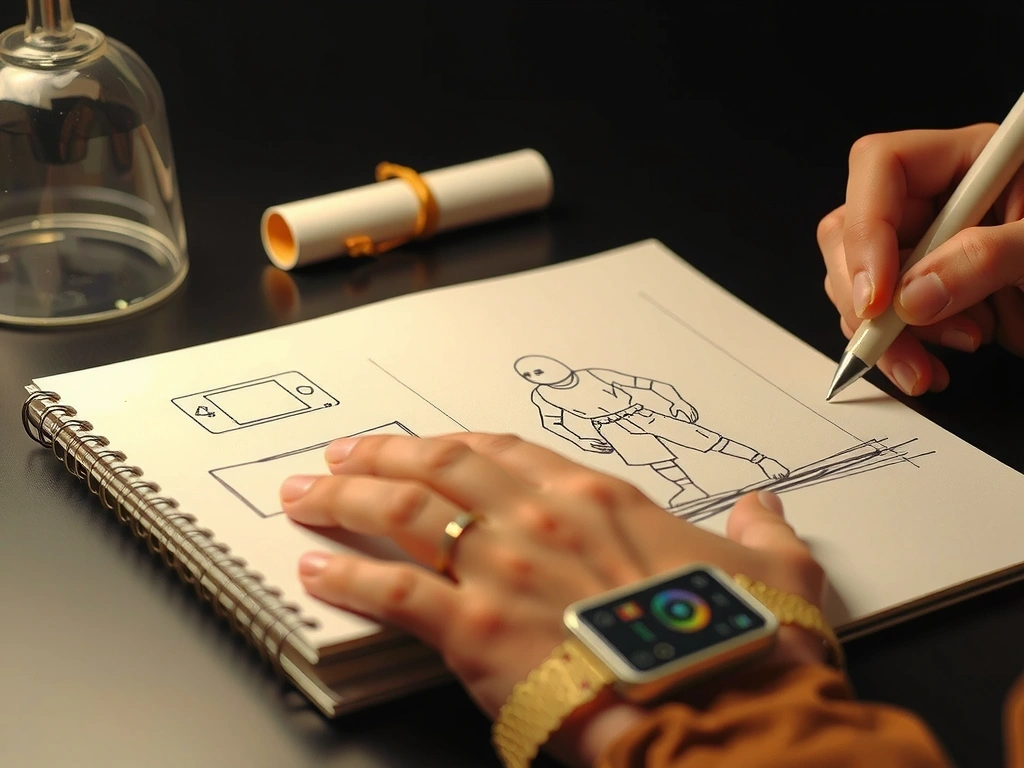
A competitive player in Milan sketches a new movement idea on a napkin. Three weeks later, it's a polished prototype with haptic feedback that feels distinct. That's our three-act methodology in action.
This page documents how we move from abstract concepts to playable reality, balancing creative ambition with technical constraints.
Phase 1 Output
Interactive Figma prototype testing the core jump-and-dash loop.
Act I: The Spark
Raw Idea to Interactive Prototype
This is the messy creative phase where ideas are cheap, and speed is everything. We focus exclusively on the core loop—the repeatable action that defines the game's soul. Everything else is noise.
"If you can't make it fun with a circle and a square, you won't make it fun with a million-dollar asset pipeline."
Mechanics First
Every concept must be validated with placeholder art. Visual polish comes later to avoid feature creep.
Audio as Foundation
Sound designers are embedded early. A satisfying 'pop' or a specific tone can define a mechanic before it's even drawn.
Collaborative Sprints
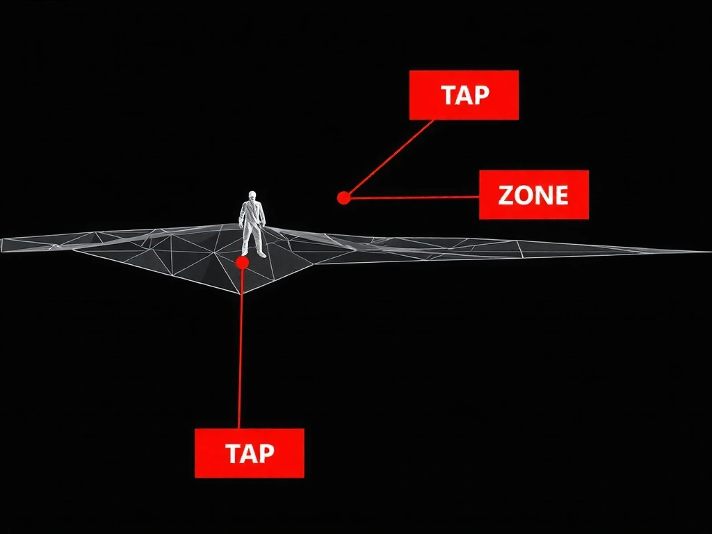
48-hour build challenges using Figma or ProtoPie. If the gesture doesn't feel right on a phone screen, it's cut.
Prototype Gallery
Act II: The Forge
Sculpting Identity & Tactile Feedback
Once the core loop is fun, we build a unique visual language. This isn't just "making it pretty." It's engineering a system where every pixel, motion curve, and haptic pulse communicates the game's emotional tone.
The Motion Library
We define a single easing curve for all primary interactions. This creates subconscious consistency. A 'pop' feels faster than a 'slide,' guiding user focus.
Over-animations cause nausea. We cap motion duration at 300ms for UI elements and test for vestibular comfort.
Stylized vs. Familiar: A unique, custom UI builds brand, but risks confusing players accustomed to platform norms. We mitigate with subtle affordance cues (e.g., slight shadow on interactive elements).
Decision Frame: Custom UI vs. Platform-Native
Benefits of Custom
- • Distinct brand identity aligned with game's world.
- • Optimized for specific gameplay rhythms (e.g., ultra-responsive controls for a rhythm game).
- • Direct control over accessibility features (high contrast modes, remappable layouts).
Benefits of Native
- • Instant player familiarity; reduced learning curve.
- • Leverages built-in OS features (e.g., iOS haptics, Android gesture navigation).
- • Faster development and testing cycles.
Our Recommendation
We start with native components for the MVP to validate the core loop. For the final version, we apply a custom "skin" that respects native interaction patterns (e.g., iOS tap targets remain 44px+, but visual style changes). This hybrid approach balances safety with distinctiveness.
Act III: The Polish
Final Asset Integration & The Feel Test
The prototype is a functional diamond; now we cut the facets. This phase is about optimization, cross-device consistency, and a final, subjective audit: does it feel right?
Asset Pipeline
Lottie for UI animations (vector-based, tiny file size). Texture compression for 2D assets (ASTC for Android, PVRTC for iOS). We keep final APK/IPA under 50MB for quick downloads.
Cross-Device QA Matrix
We test on a hardware wall: iPhone SE (2020) to iPhone 15 Pro, Galaxy A14 to S24 Ultra. Key metrics: touch latency, battery drain (measured over 30min gameplay), and visual fidelity at different screen densities.
The 'Feel Test' Protocol
Our final sign-off isn't about bug counts. It's a blind playtest with veterans. If they say, "the jump *just works*," we pass. If they mention friction, we iterate on micro-interactions.
Scenario: Critical Failure Grace
A player fails a timing-based mini-game. Instead of a generic "Game Over" screen, the UI subtly dims, a haptic pattern simulates a "miss," and the interface smoothly re-pulls them back into the retry state without a jarring modal. The failure feels like part of the rhythm, not an interruption.
Glossary: Frame Rate
Our Stance: We target 60fps for any premium-feel title. It's non-negotiable for reaction-based games. For complex 2D puzzle or narrative games, 30fps is an acceptable trade-off for richer visuals, but we always provide a high-performance mode as an option. Unstable frame rate is worse than a consistent lower one.
Our Framework
The Three-Act Creative Structure
The Spark
Ideation & Prototyping. Core loop validation with rapid builds. "Fun with shapes first."
The Forge
Visual & Interactive Design. Building a bespoke motion and tactile language.
The Polish
Optimization & Launch. Performance, QA, and the final "Feel Test" audit.
"We don't build games; we craft interactive experiences that begin the moment a finger touches the screen."
Our process is iterative. A discovery in "The Polish" (Act III) can send us back to "The Forge" (Act II) to refine a micro-interaction. This is expected and builds resilience.